Society for Innovation and Development
SID is a large division of the prestigious IISc. It was setup to use the vast repository of knowledge resident in IISc and bring it to use in the real world by collaborating with industries. SID is composed of three subdivisions who work with enterprises in different ways. One that collaborates on large research projects with Industry to solve deep science questions, one that works with medium scale industries in the manufacturing space to foster innovation in them and the third that incubates deep science based startups. How do you rebrand SID?
Challenge
SID has an umbilical connection with IISc which is one of the oldest and finest scientific institutions in the world. Finding a creative metaphor that has the stature, authenticity and gravitas that SID embodies. To evoke its historical connection with IISc but also enabling SID to grow out of the canopy of its mother organization. To brand SID is to rebrand all its divisions, we need to find the right nomenclature and design that can cut across SID and its three divisions. This was a complex and compound branding challenge. What is the creative resolution possible?
Solution
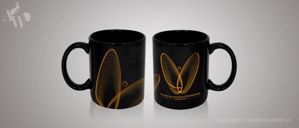
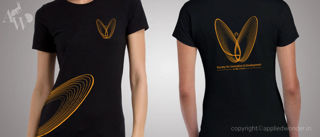
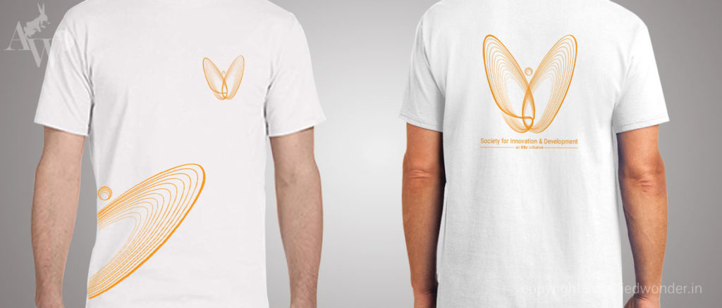
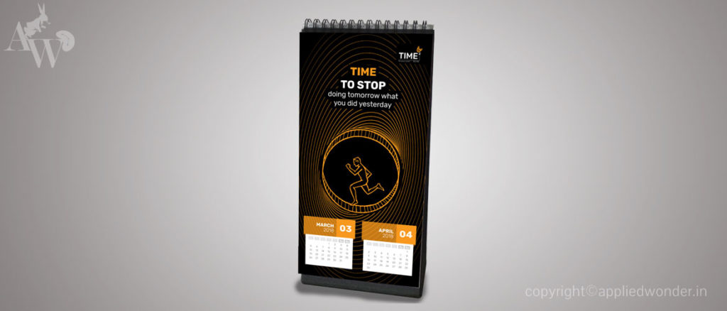
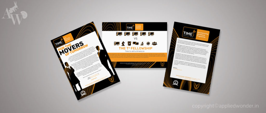
The core of SID lies in deep science and it’s roots within IISc. That is its uniqueness and lends it work and offering with depth and irreplaceability. It has a personality that is solid, deep, intellectual, frugal and introverted almost like an Amal Bose or Carl Sagan. Taking inspiration from this grand world of science of history we found a metaphor from Chaos theory in physics. The ‘Butterfly Effect’. The logo brings together letters from the word SID and the visual look of the actual Lorenze’s graph to embody the brand. This was taken forward for each of the divisions. Each division was christened with an acronym that also connoted something of the first principles. This was then extrapolated across collateral and the website.


